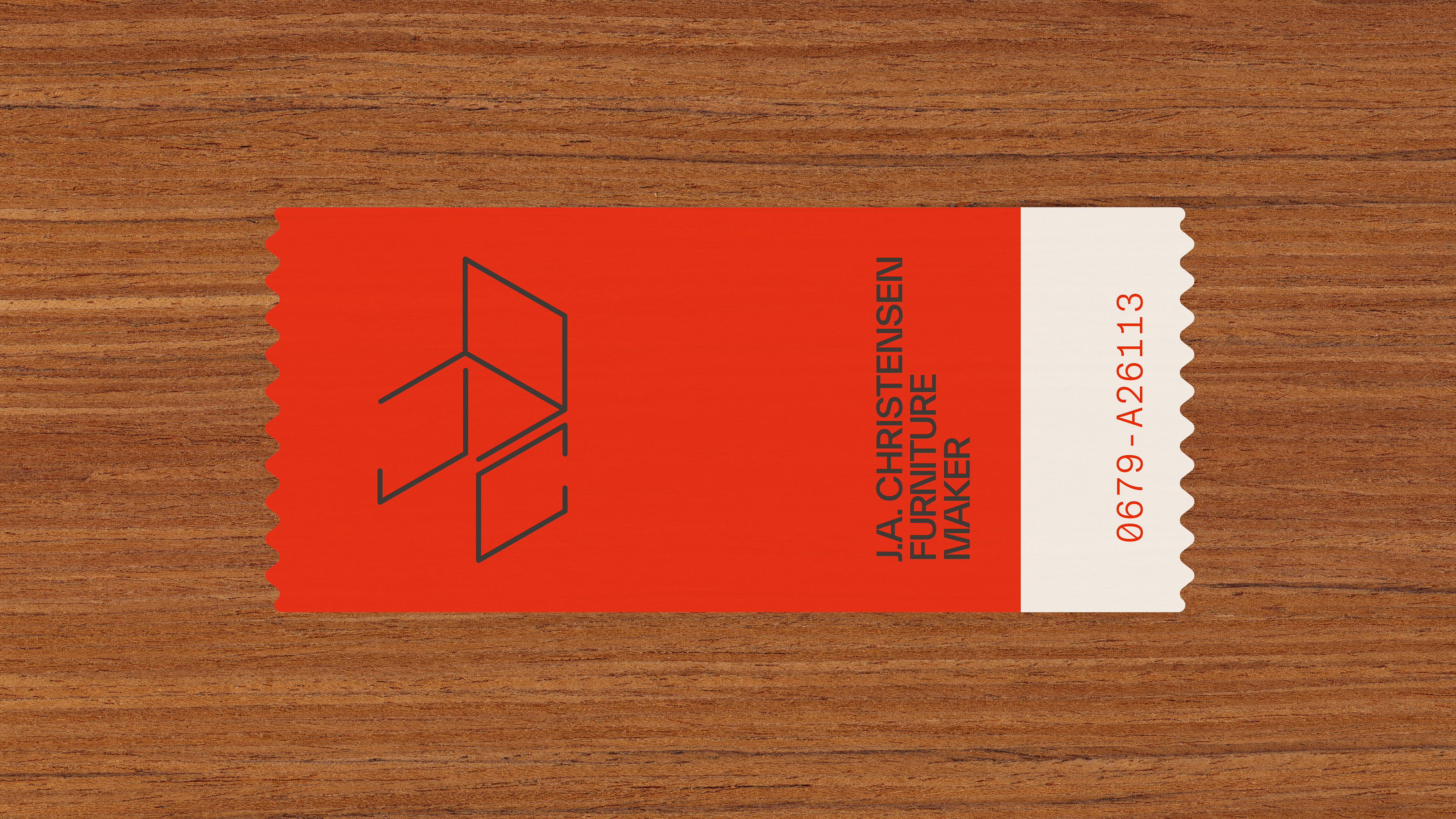
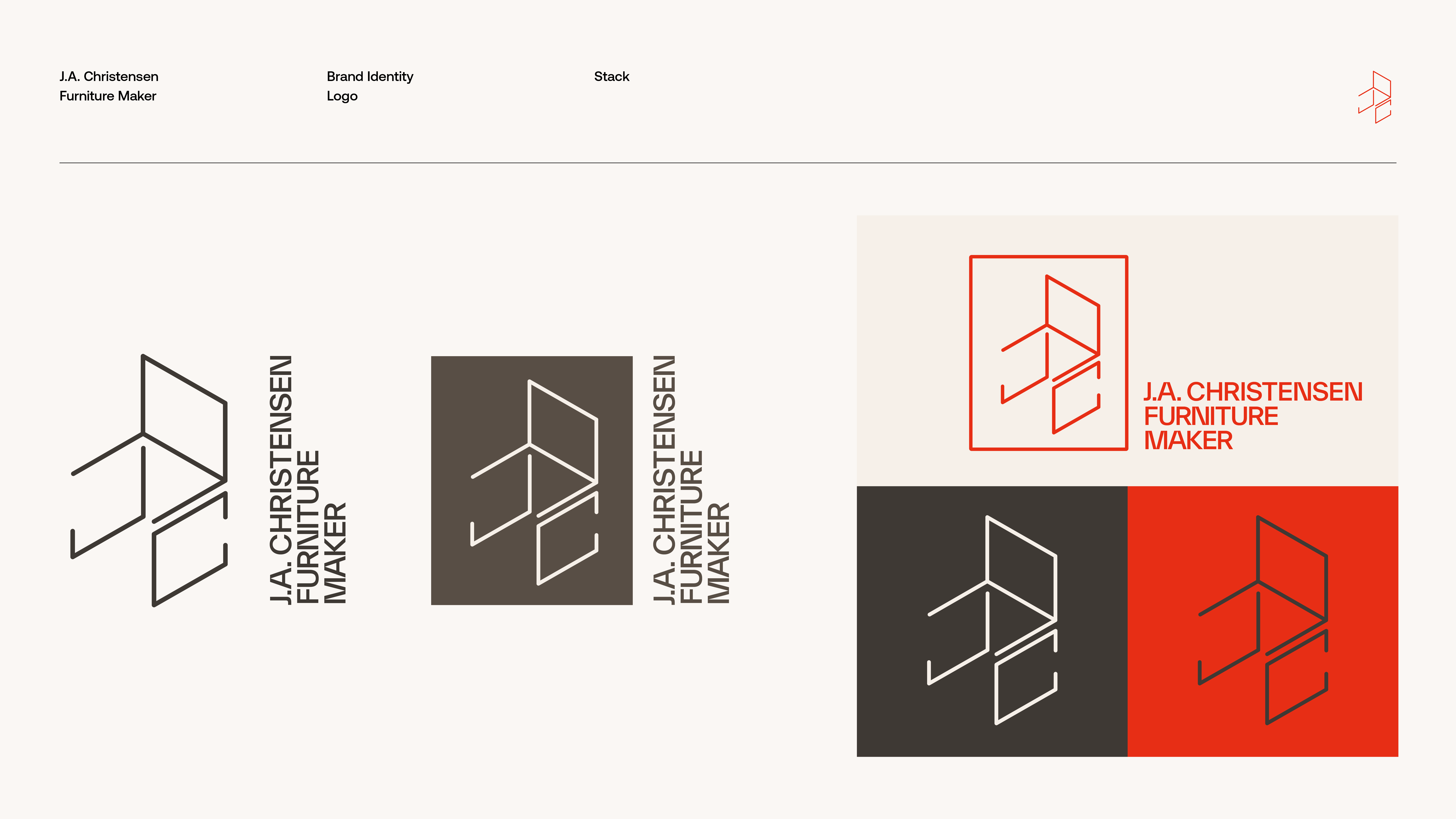
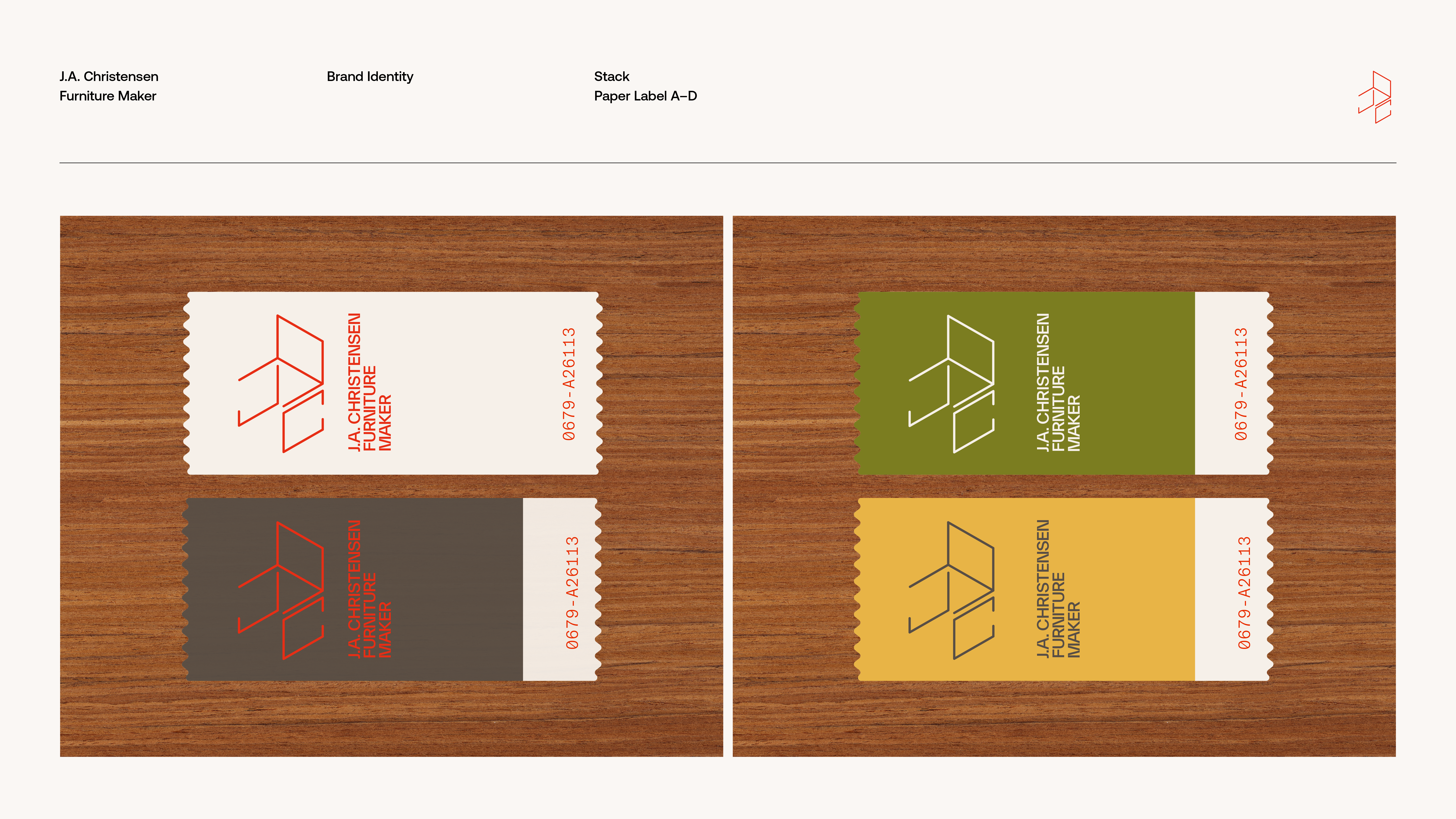
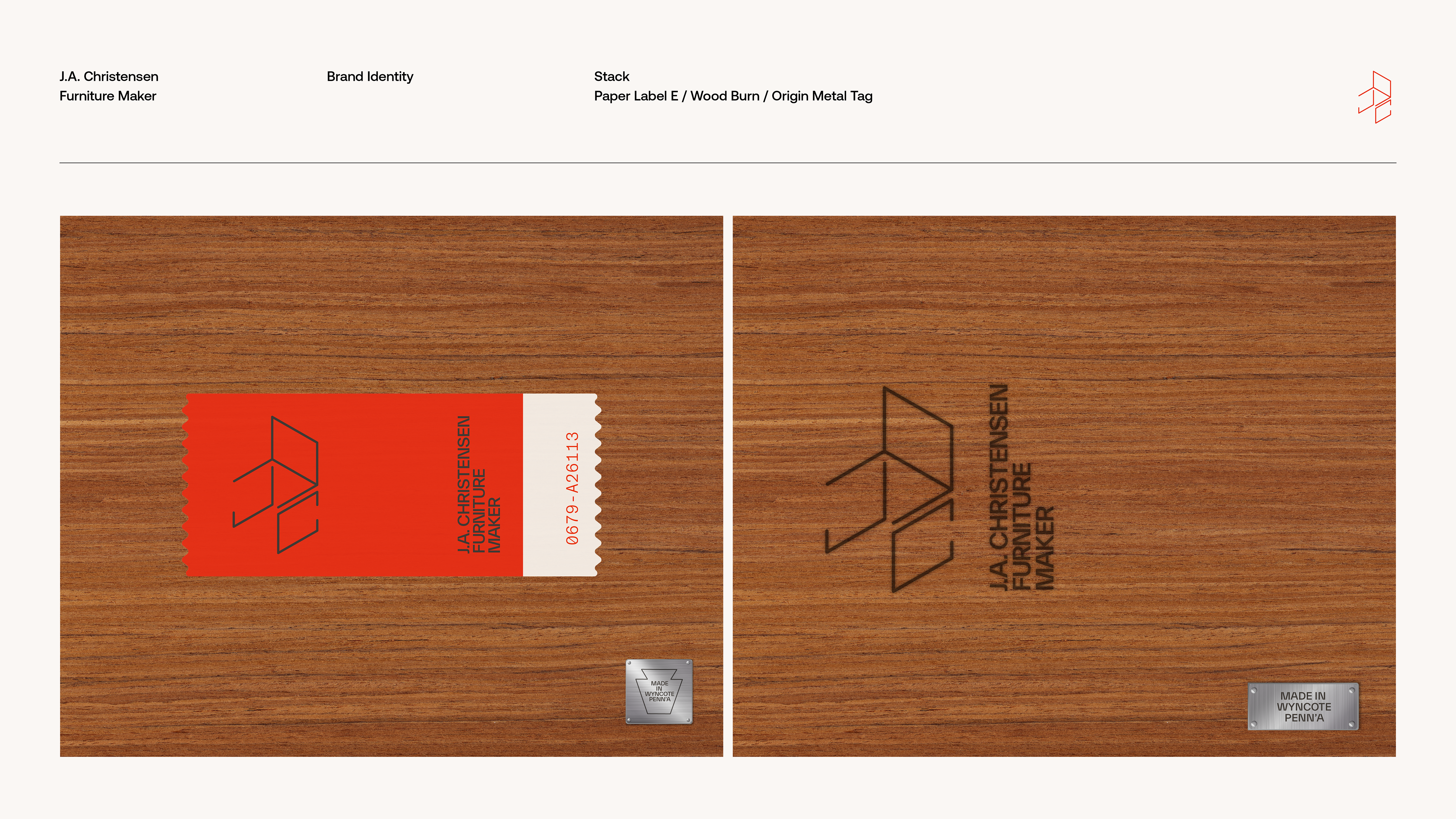
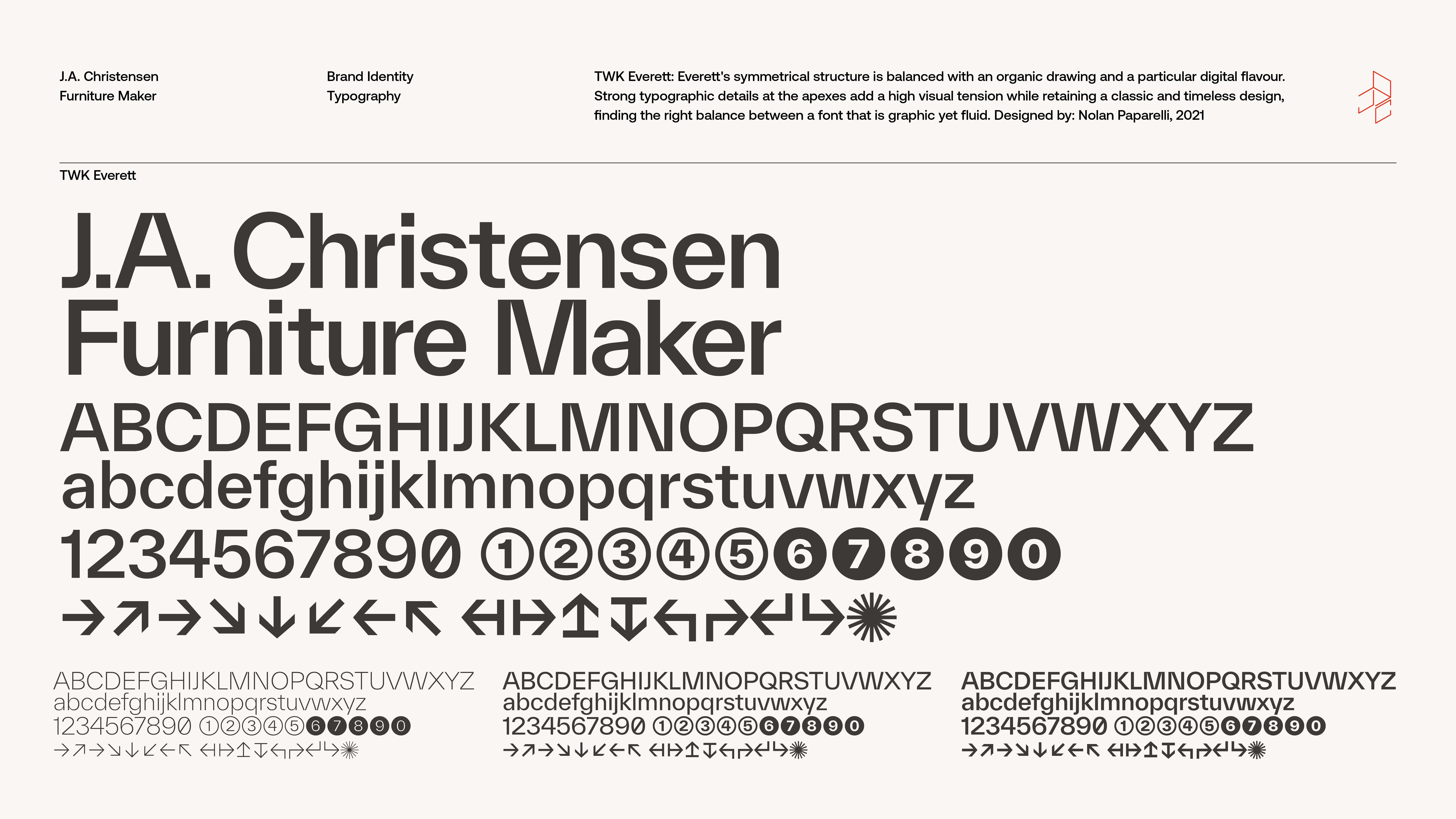
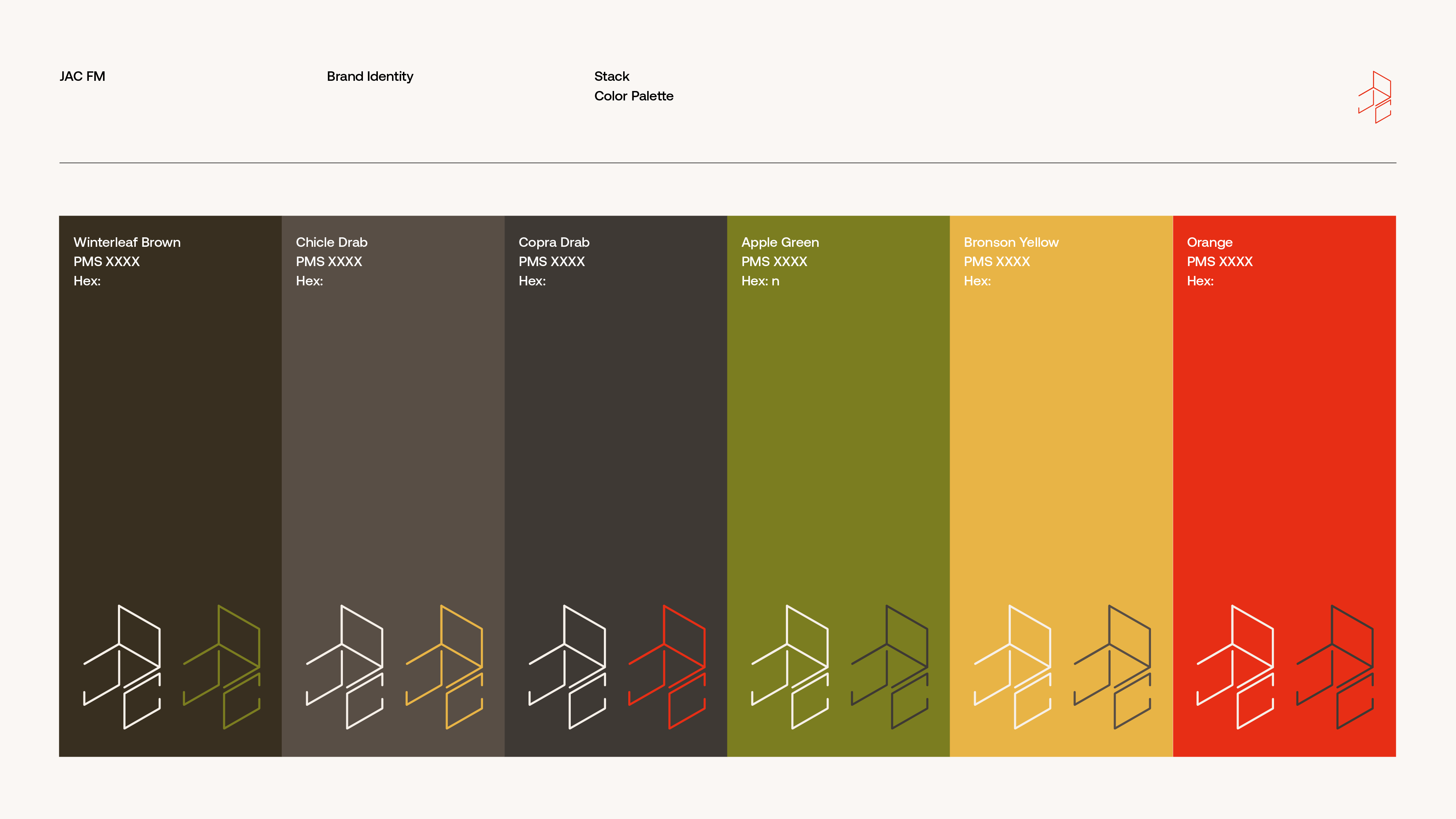
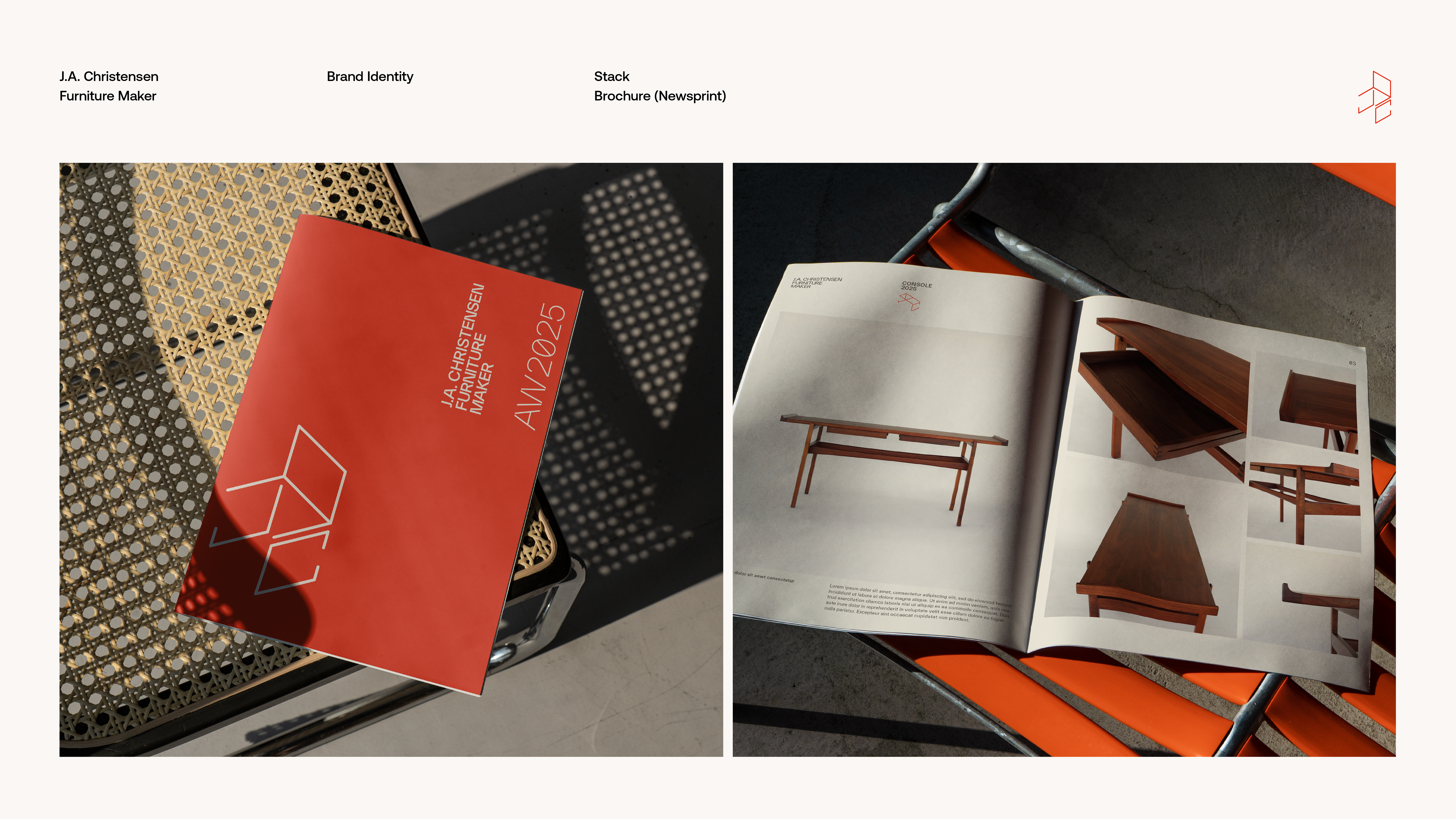
J.A. Christensen’s lifelong dedication to woodworking began in the mid-1970’s. While growing up in Western Pennsylvania, he learned his craft through observation of family, studious research, and personal practice and began working professionally by the age of seventeen. Taking cues from early makers’ marks found on studio furniture, I designed a symbol that incorporates JAC’s initials. The idea in the symbol, functional building blocks, allows the construction of an endless variety of wireframe pieces—tables, seating and storage. The typography, TWK Everett, known for its sharp yet organic design is a contemporary neo-grotesque sans-serif family designed by Nolan Paparelli. The vertices of the letterforms are allowed to terminate fully, creating sharp crotches, an architectural quality and overall visual interest. The color palette is borrowed from a 1920s Ford automotive paint book, a palette that feels as fresh today as it did then.
![]()
![]()
![]()
![]()
![]()
![]()
![]()
![]()
![]()
![]()
![]()
![]()